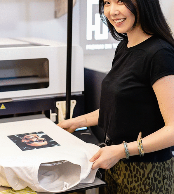
Direct-to-Film (DTF) printing has rapidly emerged as a game-changer in the custom apparel industry, offering incredible versatility to print on a wide array of fabrics, including cotton, polyester, blends, and even nylon, regardless of color. Its ability to produce vibrant, durable, and flexible transfers makes it a powerful tool for customizers and brands.
However, like any printing method, achieving truly exceptional DTF prints requires attention to detail in your artwork preparation. Follow these essential tips to ensure your DTF transfers look professional, sharp, and impressive every time.
1. High Resolution is Non-Negotiable: Aim for 300 DPI
The foundation of any great print is high-quality artwork. For DTF, this means ensuring your images are prepared at a minimum of 300 Dots Per Inch (DPI).
- Why 300 DPI? This resolution provides the necessary detail for crisp lines, smooth curves, and clear text when printed. Images with lower resolutions (like 72 DPI, common for web graphics) will appear pixelated, blurry, or “blocky” when enlarged for printing.
- Check Before You Start: Always verify your image resolution in your design software (e.g., Photoshop, Illustrator). It’s crucial to start with a high-resolution file, as you cannot effectively “upscale” a low-resolution image to 300 DPI without significant loss of quality.
2. Set Your Artwork to the Final Print Size
Designing your graphic to its exact intended print size from the outset is critical for maintaining quality.
- Avoid Resizing Later: When you scale an image up or down significantly after it’s been designed, especially raster images, you risk introducing pixelation, blurriness, or unintended distortions.
- Work at 1:1 Scale: If you know your design will be 10 inches wide, create your canvas and design at precisely 10 inches wide in your software. This ensures that every detail, line, and color will be rendered correctly at its final printed dimensions.
- Consider Placement: Think about where the design will sit on the garment (chest, back, sleeve) and what size will look best for that specific placement and garment size.
3. Ditch Halftones: DTF Doesn’t Need Them
Unlike screen printing, which often uses halftones (tiny dots) to simulate gradients and shades with fewer colors, DTF printing does not require halftones.
- Full Color Capability: DTF printers are capable of reproducing millions of colors and smooth gradients directly. Attempting to apply halftones to your DTF artwork can actually degrade the quality, making gradients appear chunky or speckled instead of smooth.
- Design with Solid Colors and Gradients: Embrace DTF’s ability to print full-color graphics with smooth transitions. Design with solid color blocks and true gradients to achieve the best results.
4. Avoid Small Text and Thin Lines
While DTF is capable of fine detail, there are practical limits to what will transfer reliably and look good on a textile:
- Minimum Text Size: As a general rule, avoid text sizes smaller than 10-12 points, especially if the font has delicate serifs or thin strokes. Very small text can become illegible or bleed together during the printing and pressing process.
- Minimum Line Thickness: Similarly, steer clear of lines thinner than 0.5pt (points). Extremely thin lines may not transfer completely, could break up, or might be difficult to weed (if applicable) and press accurately.
- Consider “Bleed”: Remember that ink can spread slightly into the fabric fibers during pressing. Thicker lines and larger text provide more tolerance for this slight expansion, ensuring your design remains sharp.
5. Utilize a Transparent Background (PNG Format)
For DTF, you’ll almost always want your design to have a transparent background.
- PNG is Your Friend: Save your final artwork as a PNG file with a transparent background. This ensures that only your design elements are printed, without any unwanted white or colored boxes around them.
- Vector vs. Raster: While vector graphics (like those from Adobe Illustrator) are ideal for scalability, if you’re using a raster image editor (like Photoshop), always ensure your background layer is removed and saved correctly as a PNG.
6. Consider Color Vibrancy and Whites
DTF printers lay down a white ink layer underneath the colors (for dark garments) to ensure vibrancy.
- Design for Impact: Understand that your colors will pop, especially on dark substrates, due to the white underbase. Design your colors to be vibrant and rich.
- Test Prints: If possible, do a test print of a new design or complex color palette to ensure the colors translate as expected from your screen to the final transfer.
By meticulously preparing your artwork with these guidelines in mind – focusing on high resolution, correct sizing, appropriate design elements, and file format – you’ll unlock the full potential of DTF printing, creating custom apparel that truly stands out with exceptional quality and detail.


